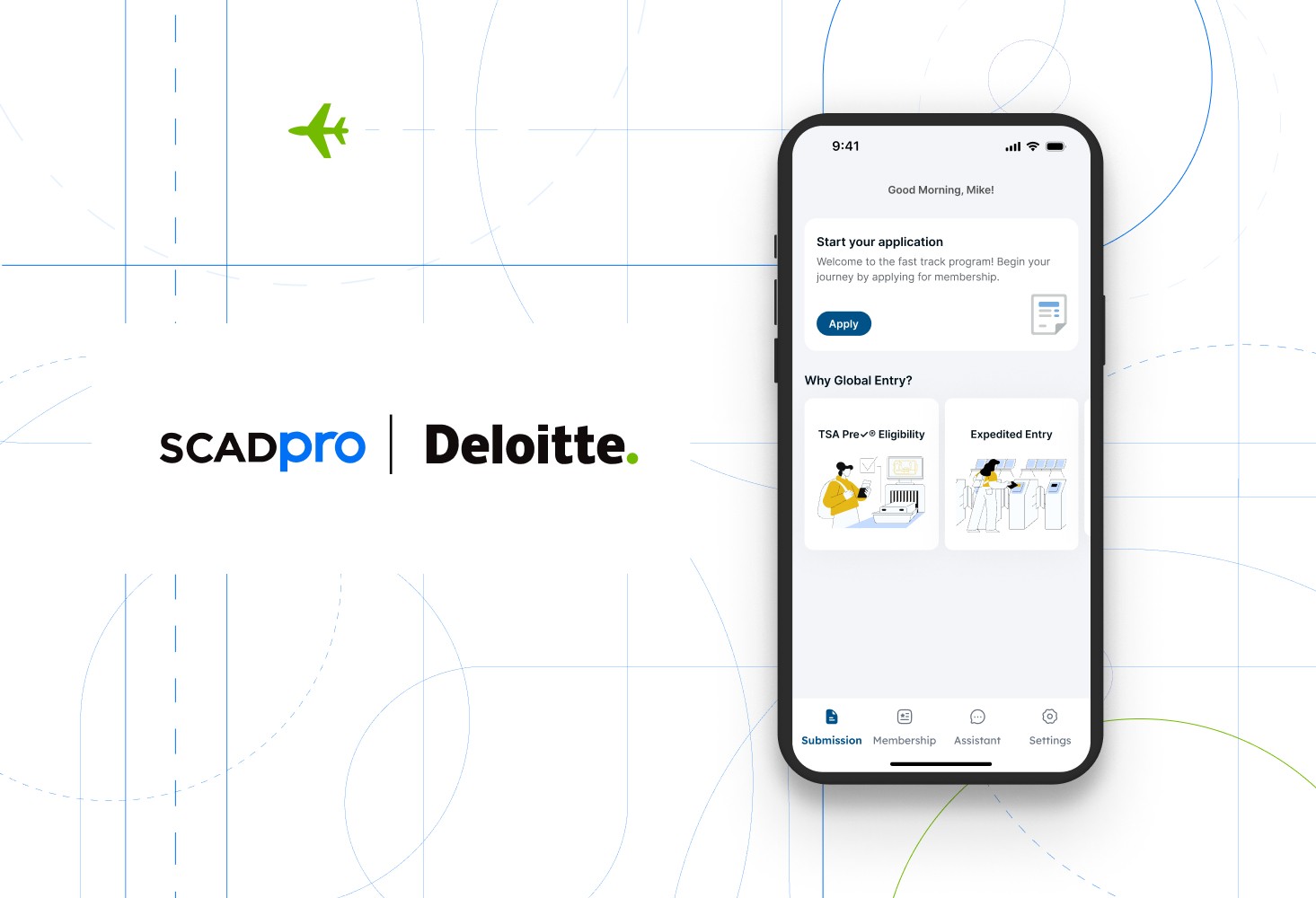
SCADpro X Deloitte | APP design of airport customs fast track
This project was commissioned through SCADpro Design Studio for Deloitte Investments.
The aim is to optimize the application service process for the government’s airport customs fast track program through design applications.
Duration
3 months
My Role
UX designer, UX researcher
Tools
Figma
Teams
Worked with a team of 20 students, including:
Product managers, UX/UI designers, UX researchers, Graphic designers, Branding designers
About My Role
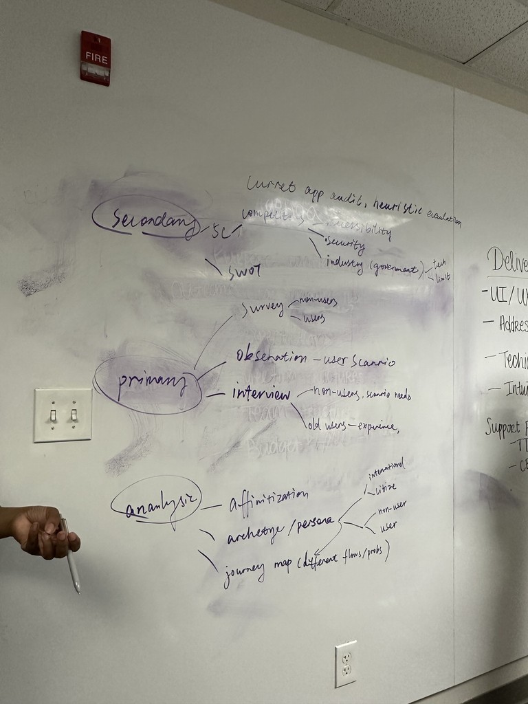
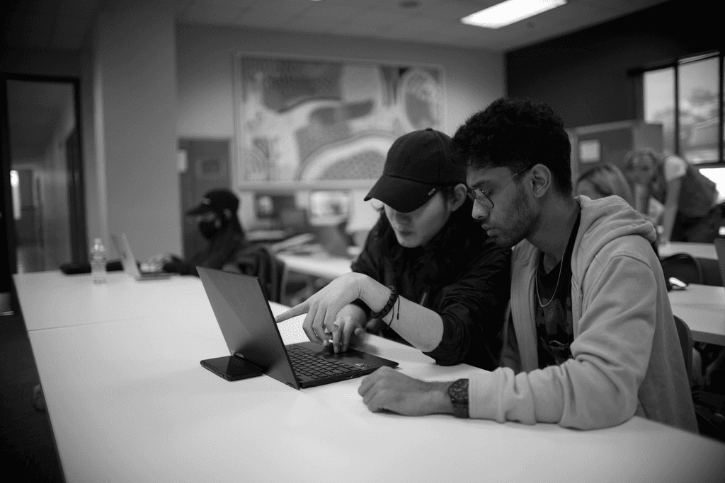
As the UX designer and researcher for this project, I collaborated with a team of nine SCADpro members to conduct research, identify design opportunities, and create design deliverables. We worked closely with Deloitte’s sales and design teams to ensure that our design solutions aligned well with the constraints and goals of both parties.
About fast track
A service that allows passengers to quickly pass through airport customs. It is similar to TSA PreCheck, requiring membership registration and an interview to obtain the privilege of expedited customs clearance. The primary target audience is typically U.S. citizens.
Product's Issue
To obtain the privilege of fast-track clearance, users must go through a complex membership application process. Even more frustrating, they may have to wait up to six months to a year to secure an interview appointment for review, leading to significant user drop-off.
Therefore, our client aims to guide users toward the airport's Enrollment on Arrival (EoA) interview service to alleviate the overwhelming demand on the Enrollment Center (EC) interview service.
Additionally, they want us to optimize the application process and provide a better user experience to attract more potential users.
Research Insights
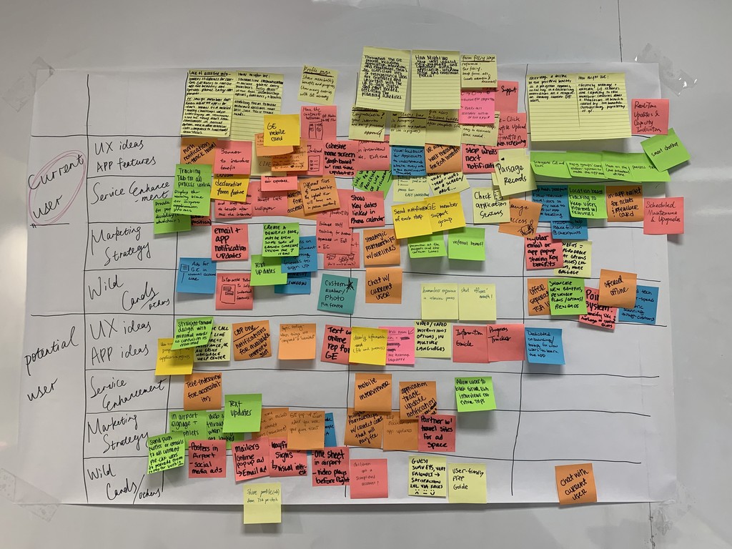
Findings from Qualitative Interviews with current user
Due to a lack of accessible information, existing users find it difficult to discover all the benefits that the fast-track service offers and to perceive the differences between the interview methods (EoA vs. EC).
Throughout the application process, there is insufficient information or transparency, leading to frustration and uncertainty for users regarding the current status of their application and the effort they have invested. This, in turn, affects their ability to plan their subsequent steps.
Findings from Qualitative Interviews with potential user
Potential users lack clear, quick, and efficient channels to understand the services and benefits that the fast-track program offers, which leads to a lack of interest in the program.
The complex application process can cause many potential users to feel frustrated and fatigued, reducing their motivation to proceed.
My Design Goal:
Optimize the application process to enhance users' sense of control and confidence during their application journey.
Increase the methods of information collection to provide users with a more streamlined and user-friendly application process.
Solution Highlights
Problem:
Users find the current application process complex and lack confidence in completing it.
Solution:
A new layout for the application interface that allows users to intuitively understand the entire process and easily access each step of the application.
Problem:
Users have to fill out a large amount of repetitive information during the application process.
Solution:
Implement camera scanning to capture user identification information and automatically fill in repetitive fields. Additionally, the camera can be used to collect biometric information, facilitating the subsequent manual review process.
Challenge in Iterations
Our initial design solution emphasized the integration and reorganization of information collection within the application process. However, after communicating with the client, we learned that we could not alter any part of the application process. Therefore, we needed to design an application experience that felt both straightforward and thorough to users, while maintaining the original process and content.
The feature of using the phone’s camera to collect biometric information was unfamiliar to most users, leading to confusion during user testing. The majority of testers did not understand how to use this feature. Through iterative design, we decided to use animations and color cues to guide users in correctly utilizing this function.
Importance of Communication
Throughout the project, I found that actively communicating with different team leaders was particularly important. As the UX designer and researcher, I needed to collaborate with both the design team and the research team. Timely communication was key to ensuring smooth collaboration between these two teams, helping to facilitate better coordination and synergy in our work.
